
For me, NetNewsWire is the perfect app for macOS. NetNewsWire 7.0, released this Tuesday (27th), reinforces this distinction. The implementation of Liquid Glass is so good that the app looks better (screenshots), without losing its identity. Extra points for the icon-free menus, mitigating one of the silliest problems in macOS 26 Tahoe. Now I’m looking forward to the iOS version.
Design
Emoji design convergence review, 2018–2026  blog.emojipedia.org
If emojis are a new language, divergent representations can render meaning lost in translation between platforms. In 2018, Emojipedia hypothesized that different emoji vendors would converge their designs. The prediction came true with Apple as the benchmark. Why?
Apple is widely regarded as the “default” emoji design set in the West. This status dates back to 2008, when Apple introduced emoji support on the iPhone years before emoji were formally incorporated into Unicode in 2010.
[…]
Market realities for over a decade have also reinforced this influence. Apple continues to command a dominant share of the mobile phone market in the United States.
A reminder that big tech companies also shape much of our lives in the details.
The article is filled with examples of convergence, controversies (remember the bright green water pistol?), and a new wave of disruptions to the semantic unity of emojis (the culprit starts with “x” and ends with “x”), all richly illustrated.
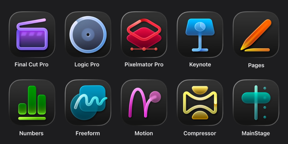
There are many interesting things in the newly announced Apple Creator Studio, Apple's “Adobe suite.”
For those who thought that the departure of Apple's VP of interface design was a harbinger of better times in that department, the new app icons (image above) indicate that nothing has changed. They are awful.
In addition, only Pixelmator Pro — which was purchased by Apple in 2025 — adopts Liquid Glass. Weird. Oh, and as part of the launch of Apple Creator Studio, Pixelmator Pro will get a version for iPadOS.
As for the offer itself, although we can't stand any more subscriptions, this format greatly reduces the barrier to entry for Apple's professional apps. They used to be one-time purchases (and still are, as an alternative), but they were so expensive that they ended up being restricted to those who have their expenses paid by their employer or make a lot of money with the tools.
Apple Creator Studio will cost USD 12.99/month or USD 129/year. Final Cut Pro alone costs USD 299, equivalent to five years of Apple Creator Studio. It is not a huge advantage in the US, but in other places, like Brazil, the gap between Final Cut Pro license and Creator Studio annual subscription is huge (BRL 1.999 versus BRL 399).
The subscription can be shared with family members.
Subscribers have access to Final Cut Pro, Motion, and Compressor (video editing), Logic Pro and MainStage (audio), Pixelmator Pro (images), templates, high-quality photos and images, and AI features for Keynote, Pages, Numbers, and Freeform.
Apple Creator Studio will be launched on January 28th.
iOS 26 still struggles to gain traction with iPhone users cultofmac.com
Ed Hardy found some very interesting data in StatCounter's figures:
[…] Roughly four months after launching in mid-September, only about 15% of iPhone users have some version of the new operating system installed. That’s according to data for January 2026 from StatCounter. Instead, most users hold onto previous versions.
For comparison, in January 2025, about 63% of iPhone users had some iOS 18 version installed. So after roughly the same amount of time, the adoption rate of Apple newest OS was about four times higher.
The adoption curve for iOS 26 is atypical, and by a wide margin. Previous years (2023, 2022) delivered numbers more similar to those of 2024, for iOS 18.
I thank all my friends who remain steadfast with iOS 18. I couldn't resist and updated mine, and although I find iOS's Liquid Glass to be the least worst among all the devices I've used so far, it's still the weirdest version since I started using an iPhone over a decade ago.
I hope these numbers set off an alarm in Apple's design department.
Update (5h10 PM): It’s possible, though unconfirmed, that a change in Safari’s user-agent is messing with StatCounter’s numbers. Other sources, however, support the suspicion of slower iOS 26 adoption, albeit to a lesser degree.
Liquid Glass
Major redesigns of graphical user interfaces (GUI) always provoke surprise and complaints. With Liquid Glass, Apple’s new visual language, it’s no different.
The good news is that beneath the new buttons, unreadable text blocks and modernized effects, the way you use systems like iOS and macOS hasn’t changed. People familiar with the previous versions will be able to find their way around the new ones.
That doesn’t mean Liquid Glass is a success. At the risk of contradicting myself later, I think Apple missed the mark.

Did you notice something different in the image above? Since Safari 18.4, released on March, Apple’s web browser no longer displays the lock icon.
Only the gods know how many times I clicked on that icon — each time accidentally, which opened an annoying popup in the middle of the screen. UI details that enhance quality of life 🙏
WebKit’s justification unfolds in two parts: 87% of all connections are now made over HTTPS, meaning secure connections are the norm; and “the presence of the lock could be creating a false sense of trustworthiness, if users instead believe it’s there to signal the website is trustworthy.”
Firefox, at least up to version 138, still displays the lock icon. Chromium, the base of Google Chrome, hid the lock icon in May 2023.
The 404s website is an ode to the not found web pages.

The 404s is an ode to the not found web pages. The name of the site refers to the standard response code of the HTTP protocol for pages not found. This site celebrates the error — and I believe that celebrating our mistakes to the point of taking pride in them is somewhat healthy.
I also think that the 404 page of this Manual could use a little attention, don’t you think?
Another chapter in the series “fascinated by the details of CSS,” this time featuring the attribute text-wrap: pretty and how browsers handle line breaks, “typographic river” (a concept I wasn’t familiar with), and the length of the final line.
Safari is the second-to-last major browser to implement text-wrap: pretty, a feature announced in a super detailed post, which is quite interesting. “Pretty” in English means “beautiful”; I find it lovely that the CSS specification delegates the decisions for presenting beautified text to each browser.

Oh, Apple’s characteristic attention to detail! After updating macOS to 15.4.1, we are greeted with one more request to activate Apple Intelligence and this visibly misaligned arrow icon.