Pacific Block, an image and video blocker for Safari, now supports Shortcuts

I’ve mentioned the Pacific Block extension for Safari in passing a few times before. It’s a content blocker, but instead of ads and trackers, it blocks images, audio, and video. It’s great for saving data on a limited mobile plan (like a pay-as-you-go carrier plan) and for speeding up web browsing on unstable connections.

Back in November 2025, I suggested a feature to Jeremy, the developer of Pacific Block: integration with the Shortcuts app, to enable automations. It shipped in version 1.8, released on the 15th.

It works! Well, it actually started working four days later, once a fix for automation uses landed in version 1.9.

I built an automation in Shortcuts exactly the way I’d pictured it a year earlier: whenever I disconnect from any Wi-Fi network, turn on both blocks (images and audio/video) in Pacific Block. Connect to a Wi-Fi network and both turn off again.

I still need to tweak it a bit. I was on a flaky wireless network the other day and noticed the automations kept firing constantly, every time iOS dropped the connection and immediately picked it back up. I think adding a couple of minutes of delay between state changes, and/or some conditionals (if… then) should fix that.

Pacific Block is a universal purchase for USD 2.99 on the App Store.

Samsung: Hand over tour health data to train AI, or we’ll delete it all

AI-drunk companies love to trumpet their millions or billions of users. What they don’t tell you is that most are forced to use such features. Think of the AI overviews that Google Search forces on you, whether you asked for it or not.

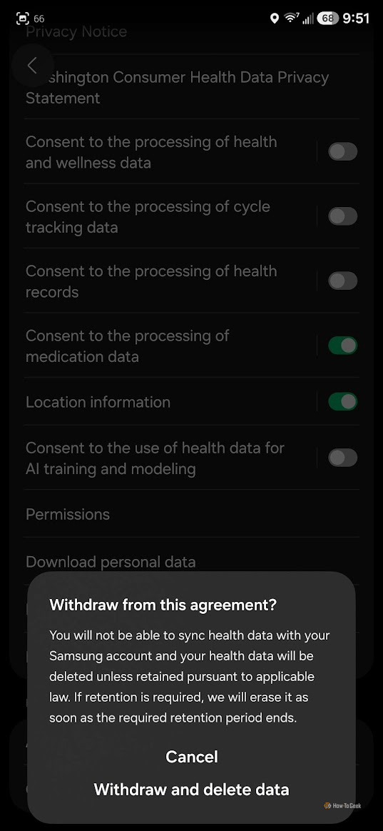
Samsung seems to have taken this tactic to the next level. According to How-To Geek, the Samsung Health app will delete users’ health data from the company’s cloud — making sync between devices impossible — unless they agree to hand it over for AI training and modeling.

The new consent toggle comes enabled by default and is buried in the app settings. It shows this message when someone tries to turn it off:

Withdraw from this agreement?

You will not be able to sync health data with your Samsung account and your health data will be deleted unless retained pursuant to applicable law. If retention is required, we will erase it as soon as the required retention period ends.

Samsung collects four types of data in Health:

  1. Health and wellness: biometric, nutritional, body composition, and sleep data.
  2. Medications: including prescriptions and dosages.
  3. Clinical exams and treatments.
  4. Menstrual cycle.

A message on Samsung’s website warns that people may have access to this data to review it.

***

Samsung’s biggest rival, Apple, is also preparing to make Apple Intelligence — its suite of generative AI tools embedded in its operating systems — mandatory starting from version 27.

Odd gestures in public

Screen compulsion is a widespread problem — anyone who says they don’t have it just hasn’t realized it yet. Is ditching the screen while keeping the tech apparatus connected to the internet a possible way out?

I’ve been thinking about this since I put an Apple Watch on my wrist. (I’ve since taken it off after four months.) Apple’s watch fulfilled the prophecy made by Brazilian pop duo Claudinho e Buchecha back in 1998 — and suddenly, I could control my calendar — and many other things — without using my hands.

(more…)

These tacky men with ridiculous glasses want you to wear them too

Meta — the same company that declared in 2021 that by now you’d be living in the “metaverse” — sold a few million camera glasses for pervs and, all of a sudden, the next future envisioned by Mark Zuckerberg’s unhinged mind is one where we all walk around wearing camera glasses powered by “artificial intelligence.”

Yes, Silicon Valley CEOs believe the best way to curb screen addiction at 20 cm from your face is to strap screens 20 mm from your eyes.

(more…)

For me, NetNewsWire is the perfect app for macOS. NetNewsWire 7.0, released this Tuesday (27th), reinforces this distinction. The implementation of Liquid Glass is so good that the app looks better (screenshots), without losing its identity. Extra points for the icon-free menus, mitigating one of the silliest problems in macOS 26 Tahoe. Now I’m looking forward to the iOS version.

Emoji design convergence review, 2018–2026 
blog.emojipedia.org

If emojis are a new language, divergent representations can render meaning lost in translation between platforms. In 2018, Emojipedia hypothesized that different emoji vendors would converge their designs. The prediction came true with Apple as the benchmark. Why?

Apple is widely regarded as the “default” emoji design set in the West. This status dates back to 2008, when Apple introduced emoji support on the iPhone years before emoji were formally incorporated into Unicode in 2010.

[…]

Market realities for over a decade have also reinforced this influence. Apple continues to command a dominant share of the mobile phone market in the United States.

A reminder that big tech companies also shape much of our lives in the details.

The article is filled with examples of convergence, controversies (remember the bright green water pistol?), and a new wave of disruptions to the semantic unity of emojis (the culprit starts with “x” and ends with “x”), all richly illustrated.

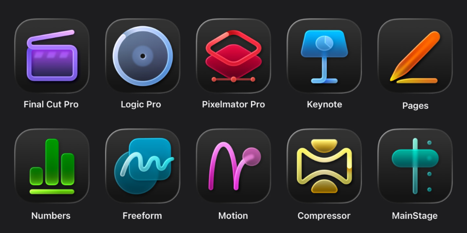
All icons for the ten Apple Creator Studio apps.
Image: Apple.

There are many interesting things in the newly announced Apple Creator Studio, Apple's “Adobe suite.”

For those who thought that the departure of Apple's VP of interface design was a harbinger of better times in that department, the new app icons (image above) indicate that nothing has changed. They are awful.

In addition, only Pixelmator Pro — which was purchased by Apple in 2025 — adopts Liquid Glass. Weird. Oh, and as part of the launch of Apple Creator Studio, Pixelmator Pro will get a version for iPadOS.

As for the offer itself, although we can't stand any more subscriptions, this format greatly reduces the barrier to entry for Apple's professional apps. They used to be one-time purchases (and still are, as an alternative), but they were so expensive that they ended up being restricted to those who have their expenses paid by their employer or make a lot of money with the tools.

Apple Creator Studio will cost USD 12.99/month or USD 129/year. Final Cut Pro alone costs USD 299, equivalent to five years of Apple Creator Studio. It is not a huge advantage in the US, but in other places, like Brazil, the gap between Final Cut Pro license and Creator Studio annual subscription is huge (BRL 1.999 versus BRL 399).

The subscription can be shared with family members.

Subscribers have access to Final Cut Pro, Motion, and Compressor (video editing), Logic Pro and MainStage (audio), Pixelmator Pro (images), templates, high-quality photos and images, and AI features for Keynote, Pages, Numbers, and Freeform.

Apple Creator Studio will be launched on January 28th.

iOS 26 still struggles to gain traction with iPhone users 
cultofmac.com

Ed Hardy found some very interesting data in StatCounter's figures:

[…] Roughly four months after launching in mid-September, only about 15% of iPhone users have some version of the new operating system installed. That’s according to data for January 2026 from StatCounter. Instead, most users hold onto previous versions.

For comparison, in January 2025, about 63% of iPhone users had some iOS 18 version installed. So after roughly the same amount of time, the adoption rate of Apple newest OS was about four times higher.

The adoption curve for iOS 26 is atypical, and by a wide margin. Previous years (2023, 2022) delivered numbers more similar to those of 2024, for iOS 18.

I thank all my friends who remain steadfast with iOS 18. I couldn't resist and updated mine, and although I find iOS's Liquid Glass to be the least worst among all the devices I've used so far, it's still the weirdest version since I started using an iPhone over a decade ago.

I hope these numbers set off an alarm in Apple's design department.

Update (5h10 PM): It’s possible, though unconfirmed, that a change in Safari’s user-agent is messing with StatCounter’s numbers. Other sources, however, support the suspicion of slower iOS 26 adoption, albeit to a lesser degree.

On macOS 26 Tahoe, run this command to disable Liquid Glass:

defaults write -g com.apple.SwiftUI.DisableSolarium -bool YES

Kinda shocked this is possible. Is Liquid Glass just a skin layered on top of macOS’s now‑classic UI? That would explain a lot… (Tip from Capi Etheriel, via r/MacOS.)

Liquid Glass

Major redesigns of graphical user interfaces (GUI) always provoke surprise and complaints. With Liquid Glass, Apple’s new visual language, it’s no different.

The good news is that beneath the new buttons, unreadable text blocks and modernized effects, the way you use systems like iOS and macOS hasn’t changed. People familiar with the previous versions will be able to find their way around the new ones.

That doesn’t mean Liquid Glass is a success. At the risk of contradicting myself later, I think Apple missed the mark.

(more…)

Partial screenshot of the Safari address bar, showing the URL of Manual do Usuário without the security lock.
Goodbye, HTTPS lock! Image: Manual do Usuário.

Did you notice something different in the image above? Since Safari 18.4, released on March, Apple’s web browser no longer displays the lock icon.

Only the gods know how many times I clicked on that icon — each time accidentally, which opened an annoying popup in the middle of the screen. UI details that enhance quality of life 🙏

WebKit’s justification unfolds in two parts: 87% of all connections are now made over HTTPS, meaning secure connections are the norm; and “the presence of the lock could be creating a false sense of trustworthiness, if users instead believe it’s there to signal the website is trustworthy.”

Firefox, at least up to version 138, still displays the lock icon. Chromium, the base of Google Chrome, hid the lock icon in May 2023.

Detail of the icon of an arrow on the right and the label “Continuar”, repeated on the right showing the difference in pixels (17 against 19) of the distancing of the icon to the edges of the button.
Image: Manual do Usuário.

Oh, Apple’s characteristic attention to detail! After updating macOS to 15.4.1, we are greeted with one more request to activate Apple Intelligence and this visibly misaligned arrow icon.

Leave our UI alone

It’s not new to me to feel uneasy when I find out some software I use has just gone through a “major update.”

Take the case of the Jellyfin app for Roku OS.

On March 26th, a major update — version 3.0.0 — was released, which the developers themselves dubbed as “😵‍💫The ‘Will Someone Please Explain To Me What Is Going On’ release 🤷”. Not a great sign. According to the changelog, it was based on a fork that’s quite different from the previous stable version it replaced.

I don’t follow the development of the Jellyfin app for Roku OS, so I got a bit of a shock when I turned on the TV and saw this update. It’s, well… different. The elements are all crammed on the screen, the exposed filters are way too distracting (and the “not played” filter is never remembered), and overall, it just looks off — subjective, I know.

By the way, I found out today that the old app was re-released on the Roku store as Jellyfin Legacy on April 1st. What a relief to go back to the old UI! The reason for keeping it available is that version 3.0.0 doesn’t work with older versions of the Jellyfin Server (10.7 and below). I couldn’t help but wonder if someone who’s been running a three years old outdated Jellyfin Server version will have the foresight to check the project’s repository when faced with an incompatible Roku OS app update, only to eventually discover that there’s a new — actually, the old — app available for download.

***

Back in the day, I used to get excited about “major updates.” “Ooh, check out those Windows 7 visual effects!” “App XYZ is now easier to use!” and so on.

Sometimes I wonder if I’ve changed. I tend to think that’s not really the case. There was a lot of room for improvement back then, and developers and designers, alongside us users, were all learning how to navigate new digital interfaces for a wide range of everyday activities. Today, it feels like most UI and UX changes are done for their own sake with little reasoning or obvious benefit to the end user.

Apple has been on this trend for a while now; the Settings apps debuting in macOS 13 Ventura, in 2022, was the pinnacle (so far) of this dumb, even hostile, trend. (Here’s a good analysis.) The possibility of a complete system overhaul this September, as the rumor mill suggests, already fills me with a huge sense of dread.

It’s interesting how this issue affects both proprietary software (like Apple’s) and open-sourced ones (like Jellyfin), though it feels like it happens more often with proprietary/closed software.

Is it too much to ask that they don’t mess with what isn’t broken? Or — even better — that they favor iterative improvements over abrupt changes?